TopoMetry — Step-by-Step Analysis
Single-cell RNA-seq measures thousands of transcripts per cell, yielding high-dimensional, noisy data with uneven sampling across cell states. Most pipelines first compress the data and then build a cell–cell graph for clustering, trajectory inference, and visualization. Yet low-dimensional representations and 2-D maps often distort the underlying geometry, and users rarely have tools to quantify or diagnose those distortions before making biological claims.
TopoMetry addresses this by learning a spectral scaffold—a diffusion/Laplacian eigenbasis that encodes latent geometry across scales—and a refined graph that better captures cell–cell relationships. From this scaffold and graph, TopoMetry derives layouts (e.g., TopoMAP, TopoPaCMAP), clustering, denoising/imputation, and diagnostics, together with operator-native metrics and Riemannian distortion maps that let you audit geometry explicitly.
In this tutorial, we’ll perform a step-by-step TopoMetry analysis on the PBMC68k dataset (~68k human peripheral blood mononuclear cells), but you could use the demo pbmc3k dataset from Scanpy to keep the run lightweight for a laptop CPU.
You will learn how to:
Set up & load data (PBMC68k) and apply adequate preprocessing (HVG selection + Z-score scaling).
Run TopoMetry to learn the spectral scaffold (fixed-time and multiscale), their refined graphs, and associated clusterings and projections.
Inspect the eigenspectrum with
tg.eigenspectrum()and interpret eigengaps for automated scaffold sizing.Estimate intrinsic dimensionality (global/local) and assess spectral selectivity of scaffold axes to labels.
Visualize with geometry-aware 2-D layouts (TopoMAP / TopoPaCMAP) and recompute layouts.
Diagnose distortions using Riemannian metrics to see where maps contract or expand the manifold.
Quantify geometry preservation across representations with operator-native metrics and a compact report.
Directly interpret geometry by assessing the contribution of each gene to the spectral scaffold.
Impute/denoise expression via diffusion on the learned operator and compare marker patterns.
Illustrate graph-signal filtering with a minimal simulated “disease state” smoothed on the multiscale graph.
Compute and visualize non-euclidean layouts: spherical, toroidal, hyperboloid and gaussian-energy embeddings with MAP.
Environment & imports
Besides topometry and standard python libraries (numpy, pandas, matplotlib), we’ll use scanpy and the AnnData data format to manage our single-cell data.
import numpy as np, pandas as pd, scanpy as sc, topo as tp
import matplotlib.pyplot as plt

np.random.seed(7)
sc.settings.verbosity = 0
sc.set_figure_params(dpi=80, facecolor='white')
print("scanpy:", sc.__version__)
print("topo:", getattr(tp, "__version__", "unknown"))
scanpy: 1.10.3
topo: 1.0.1
We’ll also use a matplotlib coloring palette:
# Palette
from matplotlib import pyplot as plt, cm as mpl_cm
from cycler import cycler
palette=cycler(color=mpl_cm.tab20.colors)
Load data
We’ll use the PBMC68k dataset — a benchmark comprising 68,000 peripheral blood mononuclear cells (PBMCs) from a single healthy donor, sequenced with the 10x Genomics Chromium platform. The raw data can be downloaded from the 10X Genomics website.
Once the data is saved to our working directory, we can read it:
adata = sc.read_10x_mtx(
    'filtered_matrices_mex/hg19/',
    var_names='gene_symbols',
    cache=True,
)
adata.var_names_make_unique()
adata
AnnData object with n_obs × n_vars = 68579 × 32738
    var: 'gene_ids'
This provides a quick inventory of what is present before any preprocessing or modeling steps. In the sections that follow, these fields will be populated with QC metrics, normalized expression, embeddings, and neighborhood graphs, and the same summary printout can be used to confirm that each stage wrote outputs to the expected locations.
Simple quality control
Before proceeding with the analysis, we perform some basic quality control:
adata.var['mt'] = adata.var_names.str.startswith('MT-')
sc.pp.calculate_qc_metrics(adata, qc_vars=['mt'], percent_top=None, log1p=False, inplace=True)
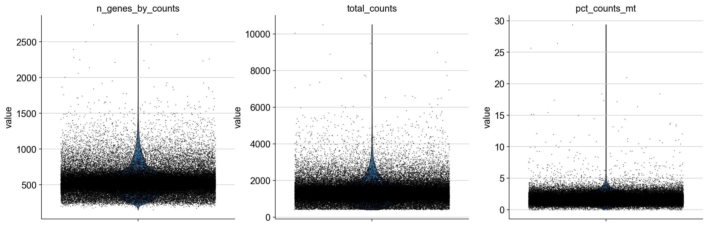
Plot QC metrics:
sc.pl.violin(adata, ['n_genes_by_counts', 'total_counts', 'pct_counts_mt'],
             jitter=0.4, multi_panel=True)
Filter low-quality cells:
sc.pp.filter_cells(adata, min_genes=200)
sc.pp.filter_genes(adata, min_cells=3)
adata = adata[adata.obs.pct_counts_mt < 5].copy()
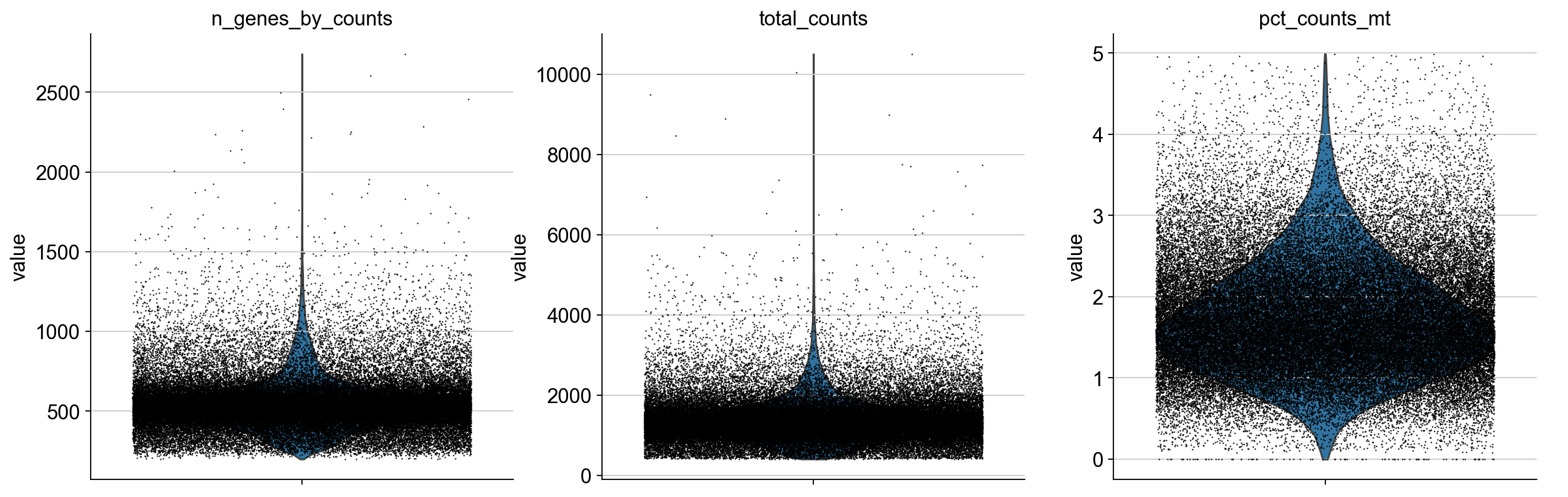
Plot filtered QC results:
sc.pl.violin(adata, ['n_genes_by_counts', 'total_counts', 'pct_counts_mt'],
             jitter=0.4, multi_panel=True)
Expected normalization
TopoMetry expects Z-score–normalized (standardized) expression values for a set of highly-variable genes (HVGs). Concretely: after normalization and log-transform, select HVGs, then scale each gene to mean 0 and unit variance (optionally clipping extreme values).
The automated wrapper tp.sc.preprocess(adata) performs exactly these preprocessing steps and prepares adata.X for TopoMetry’s base graph construction.
adata = tp.sc.preprocess(adata)  # prepares adata.X for base graph construction
adata
AnnData object with n_obs × n_vars = 68265 × 3000
    obs: 'n_genes_by_counts', 'total_counts', 'total_counts_mt', 'pct_counts_mt', 'n_genes'
    var: 'gene_ids', 'mt', 'n_cells_by_counts', 'mean_counts', 'pct_dropout_by_counts', 'total_counts', 'n_cells', 'highly_variable', 'highly_variable_rank', 'means', 'variances', 'variances_norm', 'mean', 'std'
    uns: 'log1p', 'hvg'
    layers: 'counts', 'scaled'
The tp.sc.preprocess(adata) wrapper is equivalent to the legacy scanpy preprocessing:
sc.pp.normalize_total(adata, target_sum=1e4)
sc.pp.log1p(adata)
sc.pp.highly_variable_genes(adata, flavor="seurat_v3")
adata = adata[:, adata.var.highly_variable]
sc.pp.scale(adata, max_value=10)
and automatically handles adata.layers and adata.raw.
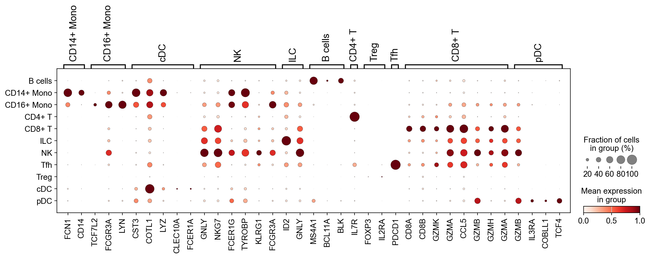
Minimal celltype annotation
After preprocessing, let’s perform some minimal celltype annotation. We take advantage of the fact that PBMCs are very well studied and use known marker genes to construct a simple classifier to annotate the main cell types:
marker_dict = {
    "CD14+ Mono": ["FCN1", "CD14"],
    "CD16+ Mono": ["TCF7L2", "FCGR3A", "LYN"],
    "cDC":        ["CST3", "COTL1", "LYZ", "CLEC10A", "FCER1A"],
    "NK":         ["GNLY", "NKG7", "CD247", "FCER1G", "TYROBP", "KLRG1", "FCGR3A"],
    "ILC":        ["ID2", "PLCG2", "GNLY", "SYNE1"],
    "B cells":    ["MS4A1", "ITGB1", "COL4A4", "PRDM1", "IRF4", "PAX5", "BCL11A", "BLK"],
    "CD4+ T":     ["CD4", "IL7R"],
    "Treg":       ["FOXP3", "IL2RA", "IKZF2"],
    "Tfh":        ["CXCR5", "PDCD1", "ICOS"],
    "CD8+ T":     ["CD8A", "CD8B", "GZMK", "GZMA", "CCL5", "GZMB", "GZMH", "GZMA"],
    "pDC":        ["GZMB", "IL3RA", "COBLL1", "TCF4"],
}

def simple_classifier(adata, marker_dict, key_added='celltype'):
    scores = {}
    for celltype, genes in marker_dict.items():
        valid_genes = [g for g in genes if g in adata.var_names]
        if valid_genes:
            scores[celltype] = np.array(adata[:, valid_genes].X.mean(axis=1)).flatten()
    if not scores:
        raise ValueError("None of the marker genes are present in the dataset.")
    scores_matrix = np.vstack(list(scores.values())).T  # Shape: (n_cells, n_celltypes)
    predicted_labels = np.array(list(scores.keys()))[np.argmax(scores_matrix, axis=1)]
    adata.obs[key_added] = pd.Categorical(predicted_labels)

simple_classifier(adata, marker_dict, key_added='predicted_celltype')

# Filter marker_dict to only include genes present in the HVG set for dotplot
marker_dict_valid = {ct: [g for g in genes if g in adata.var_names]
                     for ct, genes in marker_dict.items()
                     if any(g in adata.var_names for g in genes)}

sc.pl.dotplot(adata, marker_dict_valid, groupby="predicted_celltype", standard_scale="var")
Standard analysis (baseline)
Next, we run the de facto standard in single-cell analysis:
Dimensionality reduction with Principal Component Analysis (PCA);
Neighborhood graphs from the top principal components;
Clustering and UMAP of the PCA-derived neighborhood graph.
This will give us a baseline to compare TopoMetry to.
# run PCA
sc.pp.pca(adata, layer="scaled", n_comps=300)

# check variance ratio to choose number of PCs
sc.pl.pca_variance_ratio(adata, log=True, n_pcs=100)
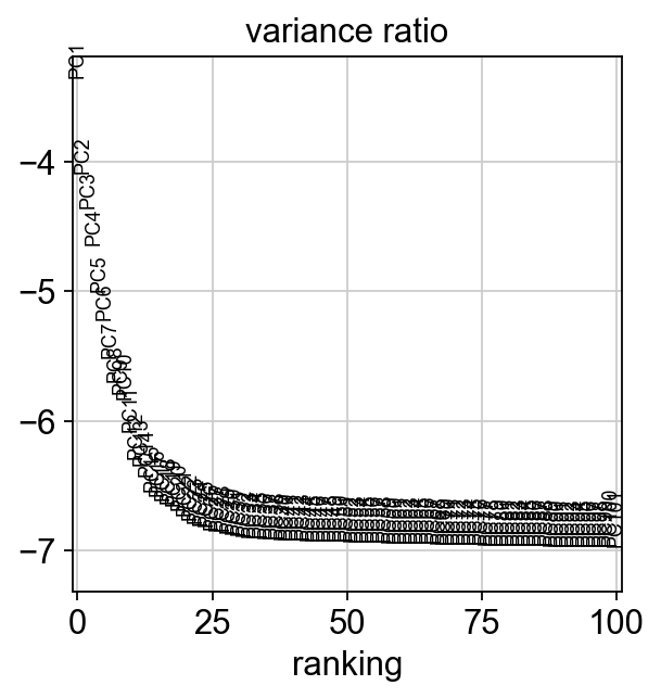
The variance ratio plot suggests that 30 PCs are enough to explain our data:
# neighborhood graph
sc.pp.neighbors(adata, n_pcs=30, use_rep='X_pca', metric='cosine', key_added='pca')
# clustering on the PCA-derived neighborhood graph
sc.tl.leiden(adata, resolution=0.5, neighbors_key='pca', key_added='pca_leiden',
flavor='igraph', n_iterations=2) # to avoid scanpy warning about default leiden implementation changing in the future
# UMAP of the PCA-derived neighborhood graph
sc.tl.umap(adata, neighbors_key='pca')
adata.obsm['X_PCA_UMAP'] = adata.obsm['X_umap'].copy()
del adata.obsm['X_umap'] #remove duplicate key
# visualize
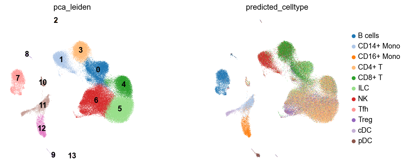
fig, axes = plt.subplots(1, 2, figsize=(11, 5))
sc.pl.embedding(adata, basis='PCA_UMAP', color='pca_leiden', legend_loc='on data',ax=axes[0], frameon=False, show=False, palette=palette)
sc.pl.embedding(adata, basis='PCA_UMAP', color='predicted_celltype', ax=axes[1], frameon=False, show=False, palette=palette)
fig.subplots_adjust(wspace=0.5); plt.show()
2026-03-10 15:21:01.343970: I tensorflow/core/util/util.cc:169] oneDNN custom operations are on. You may see slightly different numerical results due to floating-point round-off errors from different computation orders. To turn them off, set the environment variable`TF_ENABLE_ONEDNN_OPTS=0`.
We can also visualize how well PCA explains this data:
adata_raw = adata.raw.to_adata().copy()
tp.sc.pca_explained_variance_by_hvg(adata_raw)
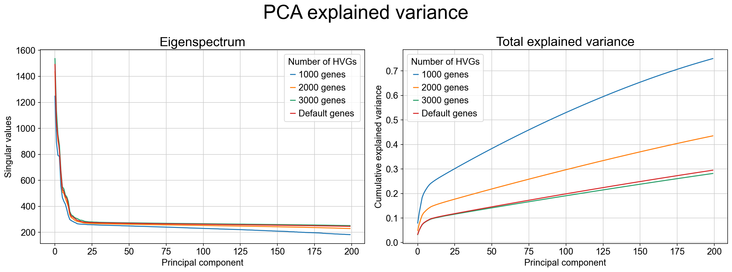
As the variance-ratio curve suggests, the first ~30 PCs appear to capture “most of the signal,” but this impression can be misleading. In practice, PCA retains only a modest fraction of the total variance even with many components (often <30% by 50 PCs in this dataset), and extending to more PCs typically yields diminishing returns rather than recovering the missing structure. This pattern is common when biologically relevant variation is distributed across many weakly correlated directions and/or organized along nonlinear manifolds, where linear projections cannot efficiently parameterize the geometry.
Fit TopoMetry (high‑level wrapper)
When analyzing single-cell data stored in an AnnData object, we use the high-level wrapper tp.sc.fit_adata(), which conveniently constructs a tp.TopOGraphobject and writes the results to AnnData. Most knobs that control the underlying TopOGraph construction are exposed through fit_adata() either as explicit arguments (e.g., projections, do_leiden) or passed through as keyword arguments to TopOGraph (e.g., kNN sizes, kernel/metric choices, intrinsic dimensionality settings). The defaults are designed for robust geometry recovery across diverse single-cell datasets, but the key parameters below determine speed, granularity, and how “local” vs “global” structure is emphasized.
Core geometry / graph parameters:
base_knnandgraph_knn: set the neighborhood size used to build the initial kNN graph and the refined graph on the learned spectral scaffold;base_metricandgraph_metric: specify the distance metric used at each stage (often cosine in expression space and euclidean in scaffold space);Kernel choices (
base_kernel_version,graph_kernel_version): control adaptive bandwidth behavior and therefore how density variation is handled;backend: selects the kNN backend library;n_jobs: controls parallelism.
Intrinsic dimensionality parameters: TopoMetry estimates local intrinsic dimensionality to automatically size the spectral scaffold.
id_method: selects which estimate is used to set the scaffold size;min_eigs: sets a floor on how many eigenvectors are computed when learning the spectral scaffold;id_min_componentsandid_max_components: cap the number of components actually kept for downstream steps to control runtime and memory;id_headroomdefine guardrails so the chosen scaffold dimensionality is neither under- nor over-sized.
Visualization and clustering parameters:
projections=("MAP","PaCMAP"): specifies which 2-D layouts should be computed from the learned scaffolds;do_leiden=True: runs Leiden clustering on the refined operator at the requestedleiden_resolutions.
tg = tp.sc.fit_adata(
    adata,
    projections=("MAP","PaCMAP"),
    do_leiden=True,
    leiden_resolutions=(0.2, 0.8), # example resolutions for multi-resolution clustering; adjust as needed
    n_jobs=-1, # use all cores - this is the default, but we specify it here for clarity
    verbosity=0,
    random_state=7,
)
adata
AnnData object with n_obs × n_vars = 68265 × 3000

obs: 'n_genes_by_counts', 'total_counts', 'total_counts_mt', 'pct_counts_mt', 'n_genes', 'predicted_celltype', 'pca_leiden', 'topo_clusters_res0.2', 'topo_clusters_res0.8', 'topo_clusters', 'topo_clusters_ms_res0.2', 'topo_clusters_ms_res0.8', 'topo_clusters_ms'
    var: 'gene_ids', 'mt', 'n_cells_by_counts', 'mean_counts', 'pct_dropout_by_counts', 'total_counts', 'n_cells', 'highly_variable', 'highly_variable_rank', 'means', 'variances', 'variances_norm', 'mean', 'std'
    uns: 'log1p', 'hvg', 'pca', 'pca_leiden', 'umap', 'pca_leiden_colors', 'predicted_celltype_colors', '_topo_tmp_dm', 'topo_clusters_res0.2', 'topo_clusters_res0.8', '_topo_tmp_ms', 'topo_clusters_ms_res0.2', 'topo_clusters_ms_res0.8'
    obsm: 'X_pca', 'X_PCA_UMAP', 'X_ms_spectral_scaffold', 'X_spectral_scaffold', 'X_msTopoMAP', 'X_TopoMAP', 'X_msTopoPaCMAP', 'X_TopoPaCMAP'
    varm: 'PCs'
    layers: 'counts', 'scaled'
    obsp: 'pca_distances', 'pca_connectivities', 'topometry_connectivities', 'topometry_distances', '_topo_tmp_dm_distances', '_topo_tmp_dm_connectivities', 'topometry_connectivities_ms', 'topometry_distances_ms', '_topo_tmp_ms_distances', '_topo_tmp_ms_connectivities'
The call to fit_adata creates the TopOGraph object tg (used to orchestrate the analysis) and populates the AnnData:
Cluster labels (
obs) Leiden clusters computed on the refined operators are written toadata.obs, including single-scale clusters (topo_clusters,topo_clusters_res*) and multiscale clusters (topo_clusters_ms,topo_clusters_ms_res*) at each requested resolution.Spectral scaffolds (
obsm) The learned diffusion-geometry representations are stored inadata.obsm["X_spectral_scaffold"](fixed-time) andadata.obsm["X_ms_spectral_scaffold"](multiscale), serving as geometry-faithful latent spaces for downstream analysis.Two-dimensional layouts (
obsm) Requested visualization layouts are written toadata.obsm, includingX_TopoMAPandX_TopoPaCMAPfor the fixed-time scaffold, andX_msTopoMAPandX_msTopoPaCMAPfor the multiscale scaffold.Refined neighborhood graphs (
obsp) Geometry-aware connectivities and distances learned on the scaffolds are stored inadata.obsp["topometry_connectivities"]andadata.obsp["topometry_distances"], with corresponding multiscale variants suffixed by_ms.Provenance and intermediate state (
uns/obsp) Namespaced entries inadata.unsand temporary graph objects inadata.obsprecord intermediate diffusion operators, clustering metadata, and parameters used during fitting, enabling reproducibility and inspection without polluting standard Scanpy keys.
Together, these fields constitute a complete TopoMetry result: geometry-aware latent representations, visualization layouts, refined graphs, and clustering outputs, all stored directly on adata for immediate reuse in downstream analyses.
Intrinsic Dimensionality (Global & Local)
Intrinsic dimensionality (ID) is the effective number of degrees of freedom required to describe the data locally on its underlying manifold. Unlike the ambient dimension (e.g., thousands of genes), ID reflects the dimensionality of the geometric support that cells occupy after accounting for correlations and constraints imposed by biology and measurement. In single-cell atlases, ID is rarely uniform: proliferative or cycling programs can introduce loop-like structure; branching differentiation increases local complexity near branch points; and terminal states often collapse to lower-dimensional neighborhoods. For this reason, TopoMetry treats ID as both a descriptive diagnostic and a practical control signal for representation learning.
TopoMetry estimates ID at two complementary levels. A global ID summarizes the overall complexity of the dataset and provides a principled baseline for selecting how many spectral components are worth keeping. A local (per-cell) ID map quantifies how complexity varies across the manifold and can highlight biologically meaningful regions where geometry changes, such as branch points, loops, dense terminal attractors, or technical mixing. These estimates are used by default during TopOGraph.fit() / tp.sc.fit_adata() to size scaffolds conservatively (with guardrails like minimum and maximum components), but it is often useful to recompute or inspect them explicitly when tuning runtime, debugging structure, or preparing downstream models (e.g., choosing latent sizes for parametric models).
tp.sc.intrinsic_dim(adata,
                    tg=tg, # pass the topograph to avoid redundant graph construction
                    n_jobs=-1, # use all cores - this is the default, but we specify it here for clarity
                    id_methods=["fsa", "mle"], # compute both FSA and MLE estimates
                    id_k_values=None # use multiple k values for robustness (default) - this increases runtime but can provide more reliable estimates
)
tp.sc.plot_id_histograms(adata, dpi=80)
# Results: adata.uns['intrinsic_dim_estimator']; per-cell IDs in adata.obs (id_* keys).
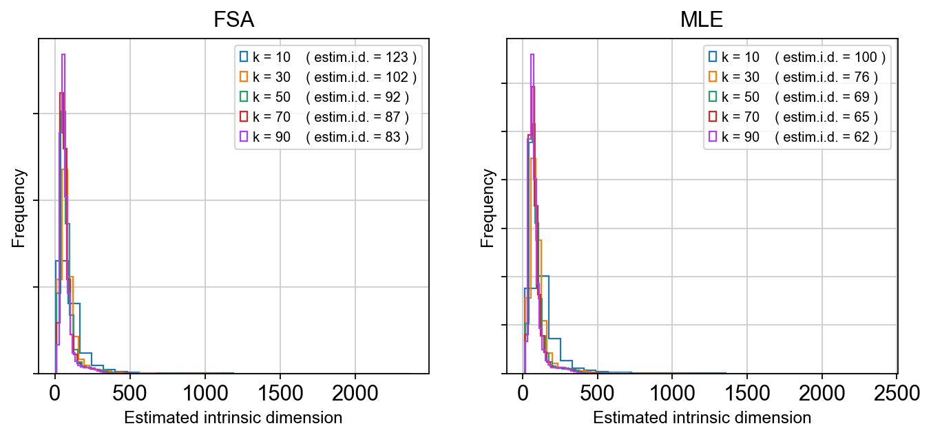
As we can see, the estimated global dimensionality is somewhere between 80 and 120. After running, the estimator object and global summaries are stored in adata.uns['intrinsic_dim_estimator'], while local ID values are written into adata.obs under id_* keys (method-dependent).
In practice, the global estimate provides a sanity check on scaffold dimensionality (too few components risks collapsing trajectories; too many wastes compute and can exaggerate noise), while local ID maps can be overlaid on TopoMAP/TopoPaCMAP layouts to localize where manifold complexity increases. Regions of elevated local ID could coincide with transition zones such as NPC-to-neuroblast progression, branch points separating lineages, or loop-like structure driven by cell-cycle dynamics, and therefore serve as an interpretable geometric guide for component selection and downstream modeling choices.
Eigenspectrum (“scree”) & eigengaps
The spectral scaffold learned by TopoMetry is built from the eigen-decomposition of a diffusion-type operator (a normalized graph Laplacian / diffusion kernel constructed on the kNN graph). Each eigenvalue–eigenvector pair corresponds to a mode of variation of the data manifold: large eigenvalues capture slow, global diffusion modes that reflect dominant biological structure, while smaller eigenvalues capture progressively finer-scale, noisier variations.
Plotting the ordered eigenvalues produces an eigenspectrum (or scree plot). The curve shows how much geometric signal is retained as additional spectral components are included. In practice, this spectrum decays rapidly at first—reflecting a small number of dominant manifold directions—and then flattens as components begin to encode noise or very local structure.
A key diagnostic feature of the eigenspectrum is the eigengap: a sharp drop between consecutive eigenvalues. An eigengap indicates a natural separation between informative dimensions and residual structure, and therefore suggests a principled cutoff for the number of scaffold components to retain. When present, this cutoff often aligns well with global intrinsic dimensionality estimates and provides an intuitive, geometry-driven justification for scaffold sizing.
tg.eigenspectrum()
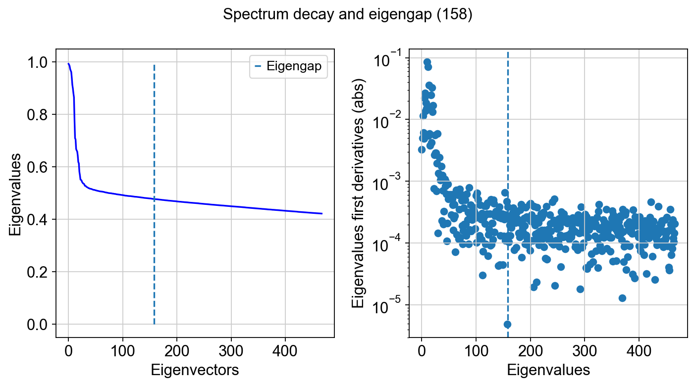
Note that the size of the spectral scaffold is usually higher than global intrinsic dimensionality estimates. That is the case because intrinsic dimensionality (ID) is a coarse summary—often a single number—of how many degrees of freedom are needed locally or on average, whereas a scaffold is an orthonormal basis intended to represent the dataset’s geometry everywhere and across multiple scales. In practice, different regions of the manifold can have different local IDs (branches, loops, mixed trajectories, terminal states), so no single small set of components captures all neighborhoods equally well. Additional scaffold components also act as “coverage”: they provide redundancy so that distinct structures can be represented on different axes, and they help stabilize downstream graphs and layouts when sampling is uneven or when transitions are sharp. Finally, diffusion/Laplacian eigenfunctions are ordered by smoothness, not by “ID relevance,” so it is common to keep more components than a global ID estimate to ensure that both broad structure and finer, region-specific variation are represented without forcing all biology into too few modes.
At the tail of the spectrum, it is common to observe eigenvalues approaching zero and then becoming slightly negative. These negative values are not meaningful geometric signal. They arise from numerical effects in finite-precision eigensolvers (typically operating in 32- or 64-bit floating point), where round-off error dominates once the true eigenvalues fall below machine precision. Many linear algebra backends effectively “flip” the sign of these near-zero modes when numerical noise overwhelms the signal. This behavior is expected and serves as an additional practical indicator that the informative spectrum has been exhausted.
Quick 2‑D visualizations
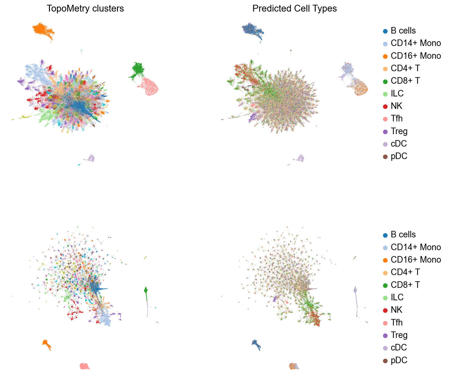
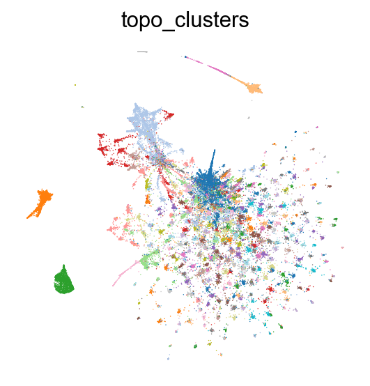
These layouts are initialized from the spectral scaffold to preserve neighborhoods while keeping global structure reasonable. All results are written to AnnData, so we can use scanpy default functions to plot these results. Let’s inspect TopoMetry’s clustering results and cell type predictions on the TopoMAP and TopoPaCMAP visualizations:
# Four subplots for the two embeddings, clustering results and predicted cell type visualizations
fig, axes = plt.subplots(2, 2, figsize=(10, 10))

# TopoMAP
sc.pl.embedding(adata, basis="TopoMAP", color="topo_clusters", ax=axes[0, 0], show=False,
                legend_loc=None,frameon=False,  title='TopoMetry clusters', palette=palette) # aesthetics
sc.pl.embedding(adata, basis="TopoMAP", color="predicted_celltype", ax=axes[0, 1], show=False,
                 title='Predicted Cell Types', frameon=False, palette=palette) # aesthetics

# TopoPaCMAP
sc.pl.embedding(adata, basis="TopoPaCMAP", color="topo_clusters", title='',  ax=axes[1, 0], show=False,
                 legend_loc=None, frameon=False, palette=palette) # aesthetics
sc.pl.embedding(adata, basis="TopoPaCMAP", color="predicted_celltype", ax=axes[1, 1], show=False,
                title='', frameon=False, palette=palette) # aesthetics

fig.subplots_adjust(wspace=0.3, hspace=0.3); plt.show()
TopoMetry also includes utilities to augment scanpy’s plots into publication-quality figures with annotation labels:
fig, ax = plt.subplots(1, 1, figsize=(6,6))

sc.pl.embedding(adata, basis="TopoMAP", color='predicted_celltype', show=False, ax=ax,
                frameon=False, palette=palette, title='') # aesthetics
tp.sc.repel_annotation_labels(adata, groupby='predicted_celltype', basis='TopoMAP', ax=ax)

plt.show()
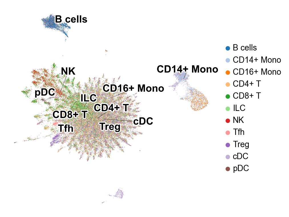
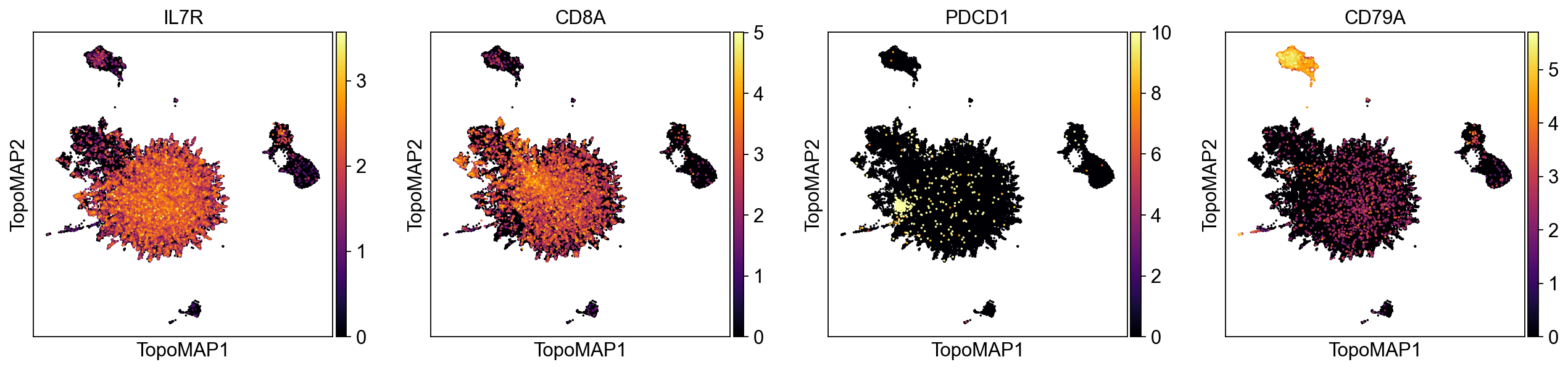
TopoMetry finds a surprisingly high number of T cell clusters in this dataset. Interestingly, some of them was classified as “Tfh” (T folicular helper).
Let’s highlight them in a TopoMAP representation to see if “Tfh” (T folicular helper) cells correspond to one of these populations:
tp.sc.highlight_embedding(adata, basis='TopoMAP', target='Tfh', groupby='predicted_celltype',
                           title='Tfh-labelled Region Highlighted', circle_size_factor=1.5)
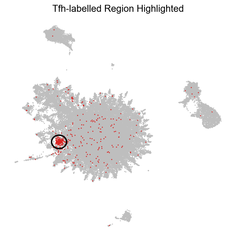
As we can see, one of the populations identified by TopoMetry could correspond to cells labelled as ‘Tfh’ (T follicular helper). Let’s check the expression of known Tfh marker genes:
sc.pl.embedding(adata, basis='TopoMAP', color=["CXCR5", "PDCD1", "ICOS"], cmap='inferno', vmin=0, frameon=False, ncols=6)
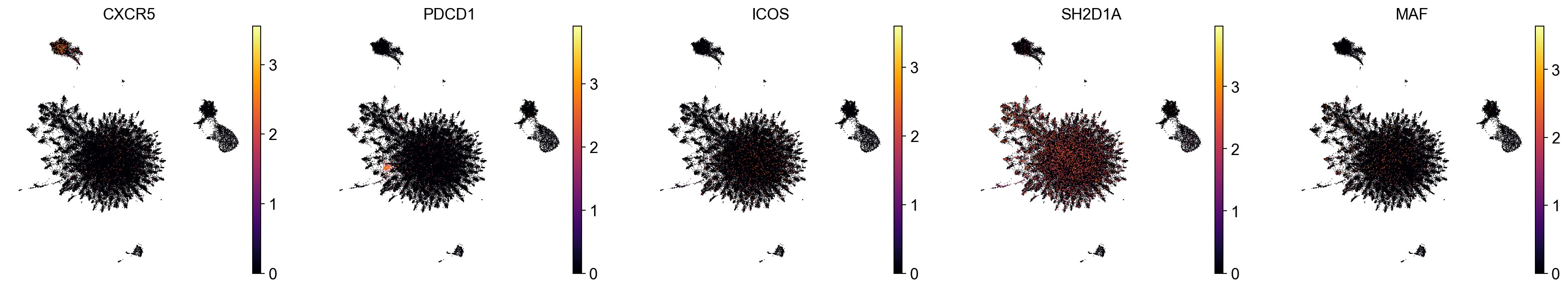
As we can see, expression of PDCD1 (encoding a immune-inhibitory receptor expressed in activated T cells) was restricted to one of the T cell clusters uncovered with TopoMetry, which was labelled as a Tfh-like population by our simple classifier.
Recomputing layouts
Although TopoMetry produces default 2-D layouts as part of the main pipeline, users often wish to recompute or fine-tune graph layouts after inspecting the results. Graph-layout algorithms such as MAP, UMAP, or PaCMAP expose hyperparameters that control trade-offs between local neighbor preservation, global structure, and visual compactness. Adjusting these parameters can improve interpretability for specific datasets or highlight particular biological features, without changing the underlying geometry learned by TopoMetry. Because layouts are downstream visualizations built on the spectral scaffold or refined graphs, they can be safely recomputed multiple times with different settings, allowing exploratory visualization while keeping the core manifold representation fixed.
Layouts can be recomputed using the TopOGraph object tg created by fit_adata():
# Remake TopoPaCMAP projection
adata.obsm['X_TopoPaCMAP'] = tg.project(projection_method='PaCMAP', multiscale=False, num_iters=100, n_neighbors=10)

# Plot
sc.pl.embedding(adata, basis='TopoPaCMAP', color="topo_clusters", legend_loc=None, frameon=False, palette=palette)
Visualizing layout optimization
In addition to inspecting the final embedding, it is often useful to visualize the layout optimization trajectory. Watching the map evolve over iterations helps diagnose whether the optimizer has stabilized, whether neighborhoods are still drifting, and whether apparent structure is an artifact of early, under-converged states. This view is also practical for tuning layout hyperparameters (e.g., number of iterations, learning-rate schedule, early exaggeration/repulsion settings, and initialization), and it builds intuition for how TopoMAP/TopoPaCMAP trade off local versus global organization during optimization.
TopoMetry includes a convenience function to visualize the process as an animated GIF, but this is currently limited to TopoMAP embeddings:
# Generate and inspect GIF — should show visible movement across frames
gif_path = tp.sc.visualize_optimization(
    adata,
    tg,
    groupby='topo_clusters', # coloring by topo_clusters allows us to see how clusters move during optimization
    num_iters=1000,  # increase number of iterations to see more movement in the GIF
    save_every=10, # save a frame every 10 iterations to balance smoothness and file size
    multiscale=True, # use multiscale spectral scaffold
    fps=15, # frames per second for the GIF
    point_size=4.0, # adjust point size for better visibility in the GIF
    dpi=100, # increase DPI for better resolution in the GIF
    filename='example_optimization.gif',
)
print('GIF saved to:', gif_path)
GIF saved to: example_optimization.gif
Riemannian distortion diagnostics
A 2-D layout is a mapping from the scaffold space to the plane. The Riemannian metric on the layout (the “pullback” of ordinary 2-D distances through this mapping) tells us, point by point, how small steps in scaffold space are stretched, squashed, or rotated by the visualization. From this metric we read:
area change (via the metric’s determinant)—negative log-det means contraction/crowding; positive log-det means expansion/over-separation;
anisotropy (via the ratio of its principal stretch factors)—large ratios indicate a strong preferred direction (ray-like stretching). By comparing these quantities to their “no-distortion” ideal (area change ≈ 0, anisotropy ≈ 1), we can judge how faithful a 2-D map is to the scaffold’s local geometry and decide whether to adjust parameters (neighbors, scaffold size, layout iterations) or prefer one layout over another.
tp.sc.plot_riemann_diagnostics(adata, tg, proj_key='X_TopoMAP', # specify any projection key in adata.obsm to compute diagnostics for that embedding
                                groupby='topo_clusters',
                                show=True,
                                do_all=False, # default False; if True, computes and plots diagnostics for ALL embeddings in adata.obsm (can be very time-consuming)
                                dpi=80)
Riemannian diagnostics for projection 'X_TopoMAP'
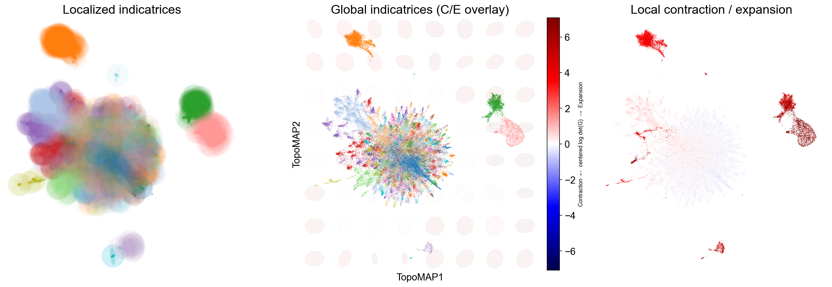
These panels quantify how a 2-D map deforms the scaffold’s local geometry:
Localized indicatrices (small ellipses at sampled points) show how distances are stretched/squashed around each cell: long ellipses indicate anisotropy (a preferred direction), round ones indicate locally uniform scaling.
A global indicatrix overlay places a coarse grid of ellipses over the entire embedding with a background heatmap of the centered log-determinant of the pullback metric (blue = contraction, red = expansion), revealing broad fields of deformation that often align with transitions or boundaries.
The per-cell deformation map colors points by the same contraction/expansion score, making bottlenecks (strong blue), hubs/mixing zones, and overly dilated regions (strong red) easy to spot.
Use these readouts to verify that neighborhoods of biological interest are not excessively distorted, decide when to adjust neighborhood sizes, and compare embeddings (e.g., TopoMAP vs alternatives) on geometric faithfulness rather than appearance alone.
In this specific case, the Riemannian diagnostics show that regions of the manifold corresponding to monocytes and B cells are expanded in the visualization (i.e., red) when compared to the original geometry, while the region corresponding to T cells is slightly contracted by the visualization.
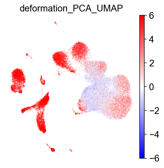
Calculate deformations
TopoMetry also includes a function to quickly calculate a per-point deformation metric for a given 2-D visualization, which can be used to identify regions of the manifold that are more or less distorted relative to the original high-dimensional space. This can be useful for interpreting visualizations:
# calculate deformation on PCA-based UMAP
tp.sc.calculate_deformation_on_projection(adata, tg, proj_key='PCA_UMAP') # stored in adata.obs['deformation_'+proj_key]

# visualize with scanpy
sc.pl.embedding(adata, basis='PCA_UMAP', color='deformation_PCA_UMAP', cmap='bwr', frameon=False, vmin=-6, vmax=6)
Geometry‑preservation metrics
To quantitatively assess how well a representation preserves the underlying manifold, TopoMetry evaluates geometry preservation by directly comparing diffusion operators. Specifically, a reference operator (P_X) is constructed on the original data space (adata.X), and each learned representation induces its own operator (P_Y). When (P_Y) closely matches (P_X), both local neighborhoods and global diffusion structure are faithfully preserved, indicating that the representation respects the intrinsic geometry of the data rather than distorting it through projection or embedding artifacts.
TopoMetry summarizes this comparison using complementary operator-native scores:
Sparse Neighborhood F1 (PF1): measures the overlap of the top-k transition supports for each cell, focusing on whether the same neighbors are retained in the diffusion process while ignoring transition weights.
Row-wise Jensen–Shannon similarity (PJS): compares the full transition probability distributions row by row, capturing how diffusion mass is redistributed and therefore sensitively reporting local geometric distortions.
Spectral Procrustes (SP) evaluates consistency at the coordinate level by aligning multiscale diffusion coordinates up to an orthogonal transform and reporting an (R^2)-like goodness of fit.
Together, these metrics provide a principled, operator-level view of geometry preservation that simultaneously probes neighborhood structure, transition probabilities, and global spectral organization.
tp.sc.evaluate_representations(
    adata,
        tg,
        return_df = False, # if True, returns a dataframe of results; if False, results are stored in adata.uns['topometry_representation_eval']
        print_results = False, # if True, prints a summary of results to the console
        plot_results = True, # controls whether to generate summary plots
        plot_path = None, # if not None, saves summary plots to the specified path
        # operator construction
        n_neighbors = 30,
        n_jobs = -1,
        # evaluation hyperparams
        times = (1, 2, 4),  # Diffusion times for Spectral Procrustes (SP).
        r = 32, # Leading eigenpairs for spectral metrics.
        k_for_pf1 = None, # Top-k used by PF1; if None, each row uses its native sparsity.
)
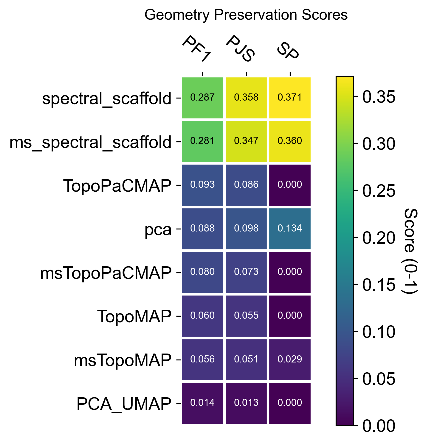
The resulting summary plots should be read as operator-level evidence of geometric fidelity. In this dataset, the TopoMetry scaffolds typically achieve higher PF1, PJS, and SP than PCA-derived spaces, indicating that their induced diffusion operators more closely match the reference operator on adata.X (i.e., neighborhoods, transition probabilities, and the global spectral organization are better preserved).
When interpreting the panels, keep the comparison within the same dimensional regime: evaluate 2-D layouts against other 2-D layouts (e.g., PCA_UMAP vs TopoMAP vs TopoPaCMAP), and evaluate latent spaces against latent spaces (e.g., PCA vs spectral scaffold). Mixing these (latent vs 2-D) is an “apples-to-oranges” comparison, because any 2-D visualization necessarily compresses more information and will generally score lower than PCA or spectral scaffolds even when it is the best possible 2-D map.
Spectral selectivity (axes ↔ labels)
The spectral scaffold is a set of eigenmodes; spectral selectivity asks which axes carry structured biological signal (clusters, gradients, trajectories) rather than noise. We score alignment at the cell and neighborhood level to identify informative axes, guide annotations, and prioritize components for downstream use.
EAS (Entropy-based Axis Selectivity) — in [0, 1]; measures how concentrated each cell’s energy is on a single spectral axis after standardization and eigenvalue weighting (λ / (1 − λ)). Higher values indicate a single dominant axis per cell (local 1D structure).
RayScore — detects coherent radial progressions along a dominant axis; defined as
sigmoid(neighborhood radial z-score) × EAS. Large values mark ray-like, outward trajectories (axis sign stored separately).LAC (Local Axial Coherence) — fraction of local variance explained by the first principal component within the k-NN neighborhood. Values near 1.0 imply locally 1-D structure aligned with a single axis.
Radius (spectral radius) — ‖Z‖₂ of standardized scaffold coordinates; a proxy for distance from the origin in spectral space that often correlates with diffusion-time progression.
Use these together to explore the geometrical structure of your data:
tp.sc.spectral_selectivity(adata, tg, groupby_candidates=['topo_clusters'])

spectral_selectivity_keys = ['spectral_EAS', 'spectral_RayScore', 'spectral_LAC', 'spectral_radius']

sc.pl.embedding(adata, basis="TopoMAP", color=spectral_selectivity_keys, ncols=4, cmap='inferno')
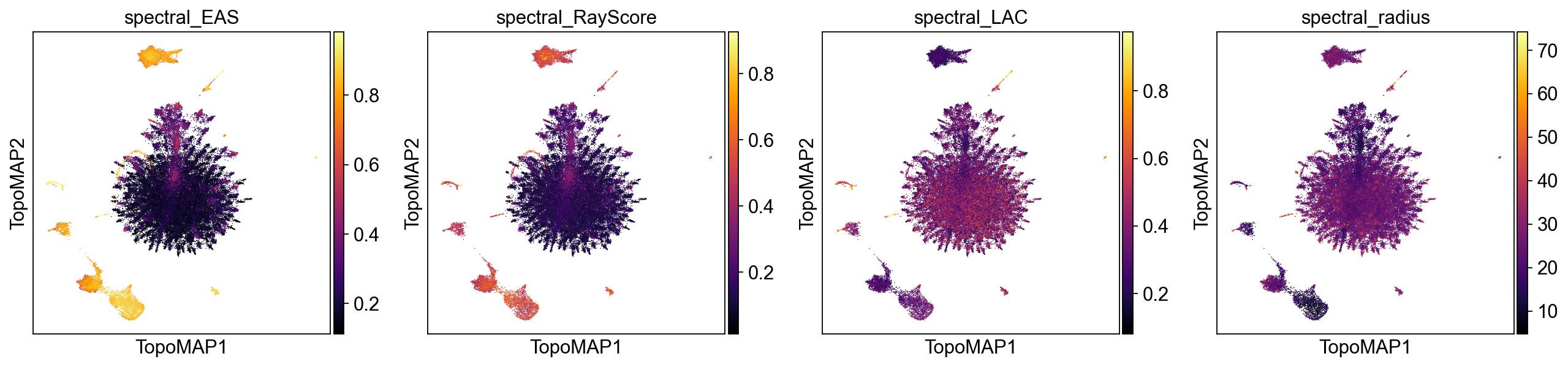
High values of EAS, RayScore, and LAC co-localized on the map indicate regions where a single scaffold axis dominates (EAS), progression is radially coherent from the spectral origin (RayScore), and local geometry is effectively 1-D (LAC). These areas are prime candidates for axis-aware annotation (e.g., a differentiation ray) and for using that axis as an ordering variable (akin to pseudotime). In contrast, patches with low EAS/LAC suggest multi-axis mixing or locally 2-D/branching structure, where a single latent coordinate will not summarize biology. The spectral radius adds context: larger radius (brighter) often tracks later “diffusion time” or more advanced states along a trajectory, whereas smaller radius marks proximal/early regions near the scaffold origin.
In practice, you can use this information to prioritize axes and neighborhoods where EAS/RayScore/LAC jointly peak, and treat low-selectivity, low-radius areas as candidate hubs, mixing zones, or early states requiring multi-axis interpretation.
Explore scaffold feature modes
Every eigenvector of the diffusion/Laplacian operator encodes a distinct geometric mode of variation across the cell manifold. Linking each mode back to individual genes—feature modes—lets you ask: which genes drive each axis of the scaffold? This is TopoMetry’s interpretability layer.
Mathematical foundation
Let \(P\) be the Markov operator (row-stochastic transition matrix) learned during
tg.fit(). Its stationary distribution \(\pi\) (the unique probability vector satisfying
\(\pi = P^\top \pi\)) describes the long-run visitation frequency of each cell and
acts as a natural, data-driven measure over the manifold.
For gene \(g\) (expression vector \(x_g \in \mathbb{R}^n\)) and scaffold eigenvector \(\psi_k \in \mathbb{R}^n\), the \(\pi\)-weighted correlation is:
Because \(\pi\) up-weights cells in dense, well-sampled regions and down-weights rare sub-populations, this correlation is more robust than an ordinary Pearson correlation on unweighted data.
Standardization modes: 'corr' vs 'corr_atanh'
standardize='corr' — returns the raw \(\pi\)-weighted correlation \(r \in [-1, 1]\).
This is the principled, interpretable choice: values are on a universal scale,
directly comparable across genes and components, and suitable for downstream tasks
such as regression, gene-set scoring, or integration with factor-analysis results.
Use this when you want loadings you can explain and quantify.
standardize='corr_atanh' — applies the Fisher \(z\)-transform
\(z = \tanh^{-1}(r)\), then normalises each column by its maximum absolute value.
Because \(\tanh^{-1}\) diverges near \(\pm 1\), it amplifies strong associations
and compresses weak ones, making faint but consistent signals stand out.
Use this for enhanced pattern discovery: revealing secondary gene programmes that are
real but modest in raw correlation, e.g. cycling genes layered on top of a
lineage axis. Note that the absolute magnitude is no longer directly interpretable
after normalisation; rank and sign remain meaningful.
Principled loadings — standardize='corr'
We run calculate_feature_modes with the default operator='X' (the base Markov
operator \(P_X\) built from raw gene space) and multiscale=True so that the
multiscale diffusion map eigenvectors are used as the scaffold. Results are stored
in adata.varm under the key feature_modes_ms_x_corr and metadata in
adata.uns['feature_modes_ms_x_corr_meta'].
tp.sc.calculate_feature_modes(
    adata, tg,
    multiscale=True,
    operator="X",
    weight=True,
    standardize='corr',
    return_results=False,
)
tp.sc.plot_feature_modes(
    adata,
    store_key='feature_modes_ms_x_corr',
    components_to_plot=range(0, 31),
    n_top_features=3,
    cmap='bwr',
    show_colorbar=True,
    fontsize=14,
)
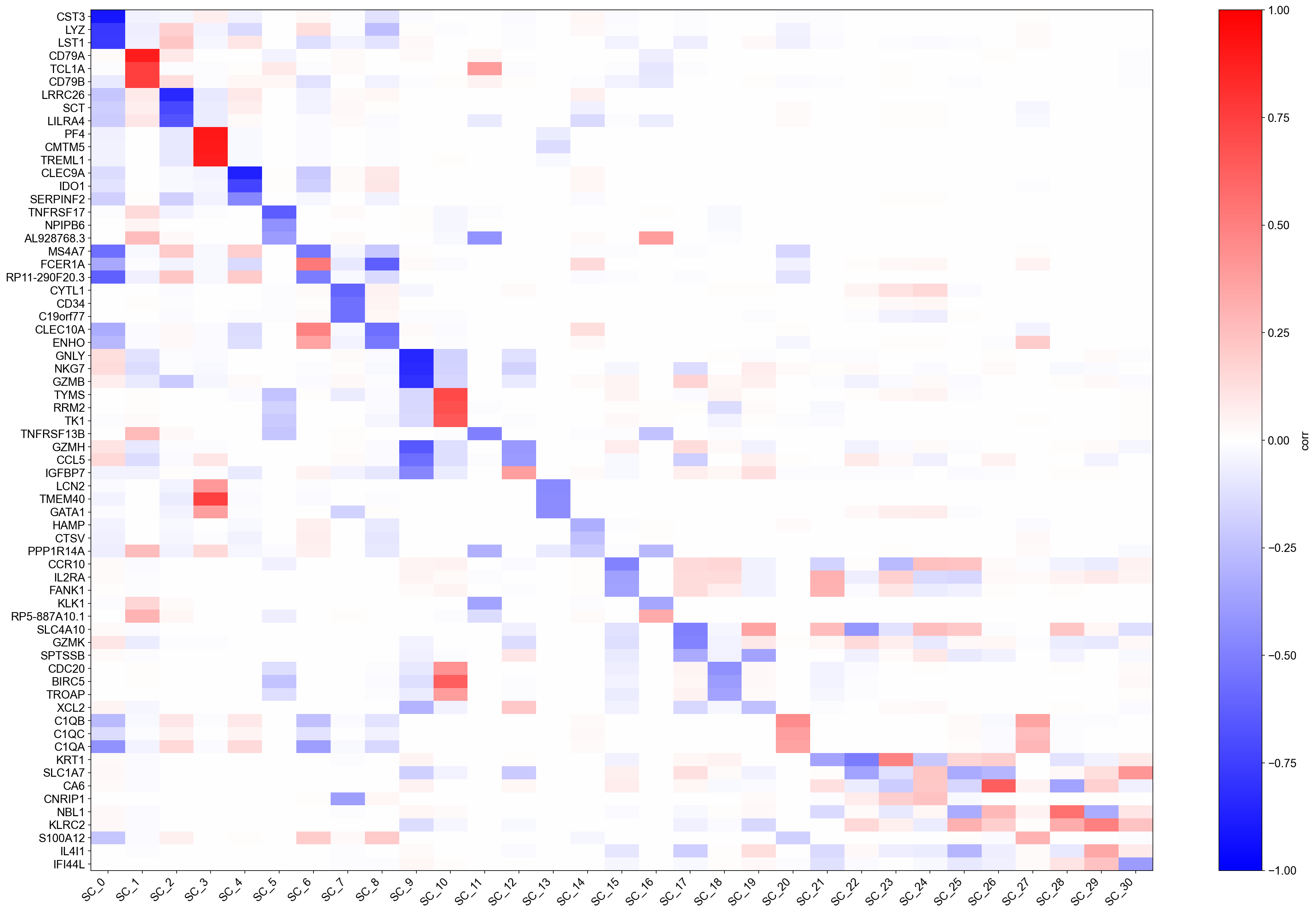
Each row of the heatmap is a gene; each column is a scaffold eigenvector (ranked by eigenvalue). Colours encode \(\pi\)-weighted correlation: red means the gene is positively associated with that geometric mode, blue means negatively associated. The top-\(k\) gene names annotated on the right are the genes with the strongest absolute correlation per component.
Because values are genuine correlations, you can immediately interpret them: a value of \(0.6\) means that gene explains ~36 % of the variance of that scaffold axis (in the \(\pi\)-weighted sense). Components with a handful of very high correlations correspond to sharp, gene-dominated axes (e.g., a lineage marker); components with many moderate correlations correspond to broad, combinatorial programmes (e.g., cell-cycle or metabolic state).
Pattern-discovery loadings — standardize='corr_atanh'
The Fisher \(z\)-transform amplifies associations near \(\pm 1\) and compresses those near \(0\). After per-column normalisation, the heatmap reveals the relative importance of genes within each component rather than their absolute correlation. This makes it easier to spot secondary gene programmes that are real but subtle.
tp.sc.calculate_feature_modes(
    adata, tg,
    multiscale=True,
    operator="X",
    weight=True,
    standardize='corr_atanh',
    return_results=False,
)
tp.sc.plot_feature_modes(
    adata,
    store_key='feature_modes_ms_x_corr_atanh',
    components_to_plot=range(0, 31),
    n_top_features=3,
    cmap='bwr',
    show_colorbar=True,
    fontsize=14,
)
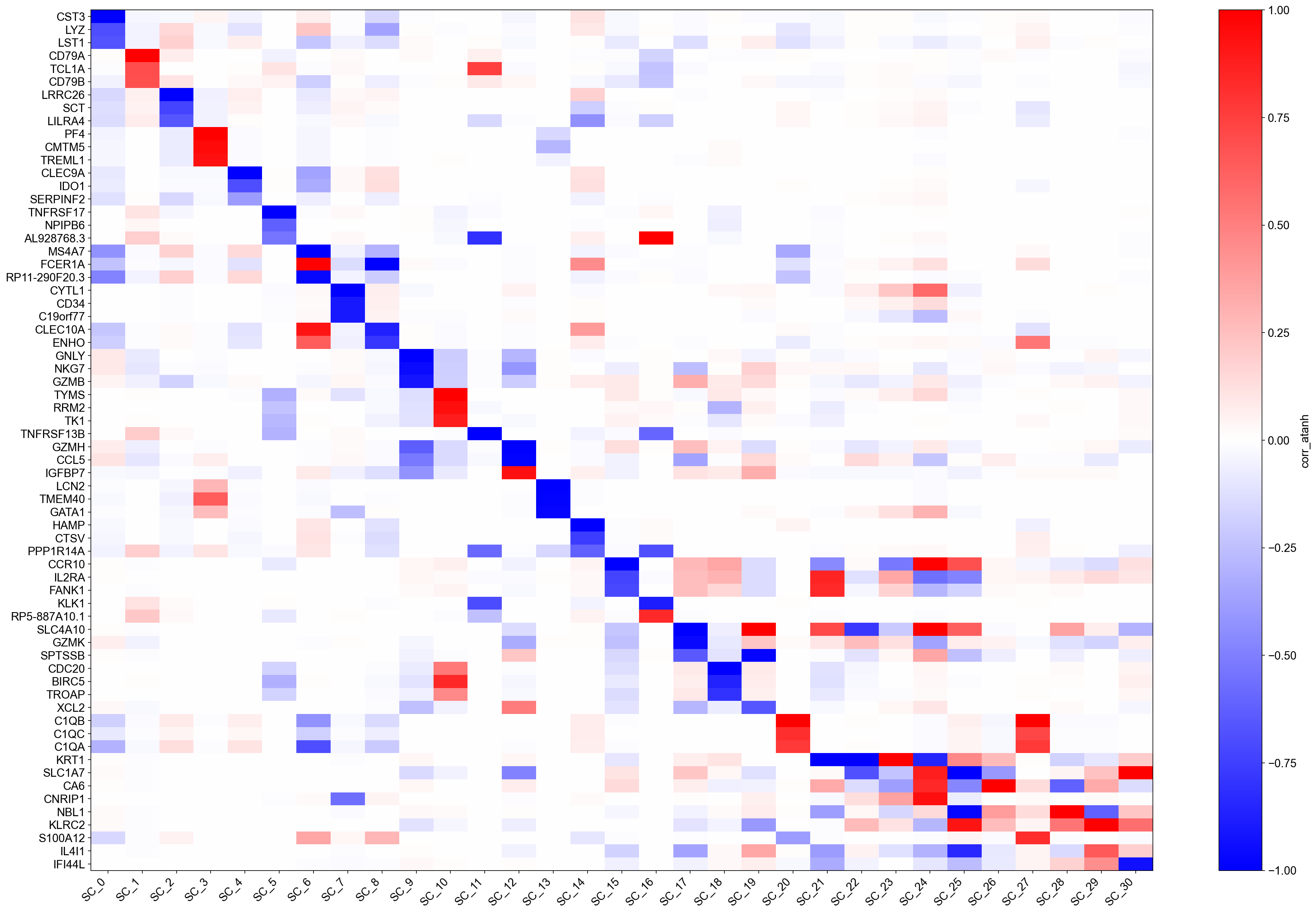
Compare this heatmap with the 'corr' version above:
Genes that had raw \(|r| \approx 0.9\)–\(1.0\) now saturate near \(\pm 1\) and appear as the dominant markers — their biological signal is very clean.
Genes with \(|r| \approx 0.3\)–\(0.5\) that were faint in the
'corr'plot may now rise into the top-\(k\) annotation list, revealing co-regulated secondary programmes.
A useful workflow is to use 'corr' for reporting and integration (e.g., feeding
loadings into GSEA or a regression model) and 'corr_atanh' for exploration
(spotting unexpected gene programmes worth following up).
You can also inspect the top genes for any component programmatically:
import pandas as pd

# Load the corr loadings and show the top 10 genes for component 0
key = 'feature_modes_ms_x_corr'
meta = adata.uns[key + '_meta']
loadings = pd.DataFrame(
    adata.varm[key],
    index=adata.var_names,
    columns=[f"SC_{i}" for i in range(adata.varm[key].shape[1])],
)
print('Top 10 genes for SC_0 (by |corr|):')
print(loadings['SC_0'].abs().nlargest(10).to_frame().join(loadings['SC_0'].rename('corr')))
Top 10 genes for SC_0 (by |corr|):
              SC_0      corr
CST3      0.906831 -0.906831
LYZ       0.777585 -0.777585
LST1      0.766309 -0.766309
FCN1      0.744018 -0.744018
S100A9    0.721993 -0.721993
AIF1      0.715348 -0.715348
SPI1      0.712691 -0.712691
CFD       0.708454 -0.708454
TYMP      0.704225 -0.704225
SERPINA1  0.679776 -0.679776
Imputation
TopoMetry supports geometry-aware imputation by diffusing expression values over the learned diffusion operator, in close analogy to methods such as MAGIC. Rather than smoothing directly in gene-expression space, imputation is performed on the refined diffusion geometry learned by TopoMetry, so information is propagated preferentially along manifold-consistent directions and across biologically meaningful neighborhoods. This approach reduces technical sparsity while minimizing spurious mixing between unrelated cell states, a common failure mode when imputation is driven by distorted low-dimensional embeddings.
Concretely, gene expression is propagated using powers of the diffusion operator, effectively averaging expression across multi-step random walks on the graph. Early diffusion steps emphasize local denoising, while later steps incorporate broader contextual information along trajectories and branches. Because the operator itself is geometry-preserving by construction, imputed values tend to sharpen continuous programs such as differentiation or cell-cycle progression without collapsing discrete populations. As with MAGIC, diffusion time controls the strength of smoothing, but in TopoMetry this parameter is grounded in the learned manifold and can be interpreted in terms of diffusion scale rather than arbitrary neighborhood size.
tp.sc.impute_adata(
    adata,
    tg=tg,
    impute_t_grid=(2, 4, 8), # diffusion times for imputation; adjust as needed - using multiple times can provide more robust imputation but increases runtime
    null_K=100, # default 1000, number of K permutations for null distribution to score against - we lower this for demonstration purposes, but for real analyses we recommend using a larger number (e.g. 1000) for more robust scoring
    raw=False, # whether to impute  adata.X (if False, default) or adata.raw.X (if True - massively increases runtime).
)
sc.pl.embedding(adata, basis='TopoMAP', color=['IL7R', 'CD8A', 'PDCD1', 'CD79A'], cmap='inferno', layer='scaled', vmin=0, size=10)
sc.pl.embedding(adata, basis='TopoMAP', color=['IL7R', 'CD8A', 'PDCD1', 'CD79A'], cmap='inferno', layer='topo_imputation', vmin=0, size=10)
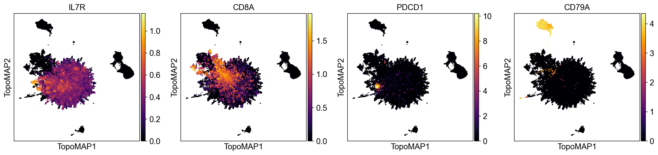
As we can see, the imputation eliminates noisy non-specific signal across different marker genes.
Graph‑signal filtering
Graph signal filtering treats measurements defined on cells—such as gene expression, categorical annotations, or experimental readouts—as signals living on a graph, rather than as independent observations. In single-cell data, the graph encodes the manifold structure of the population through neighborhood relationships, so filtering corresponds to propagating information along biologically meaningful paths while respecting the underlying geometry. By applying diffusion operators to these signals, high-frequency noise that is inconsistent with the graph structure is attenuated, whereas coherent patterns that align with trajectories, branches, or neighborhoods are reinforced. This perspective provides a principled way to denoise, smooth, and interpret cell-level signals in a geometry-aware manner, closely analogous to low-pass filtering in classical signal processing but defined over a data-driven manifold instead of a regular grid.
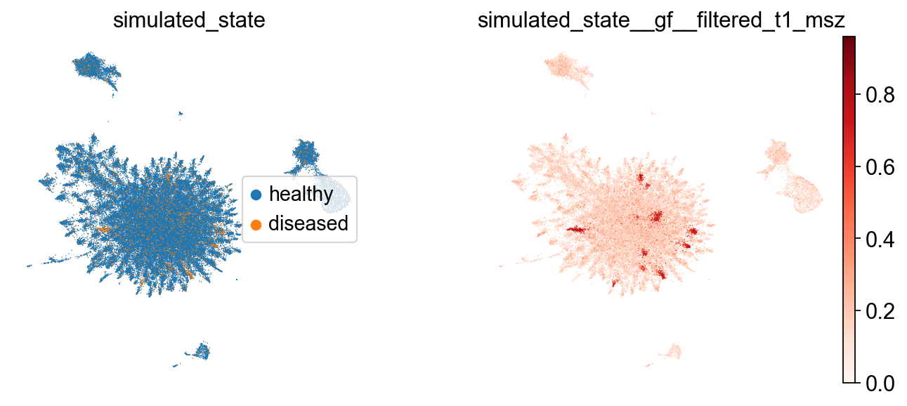
Because the example dataset (PBMC68k) consists of cells from a single healthy donor, it does not contain a naturally varying signal suitable for demonstrating graph-signal filtering. Instead, we simulate a binary disease-state label by randomly assigning half of the cells to a “disease” state:
rng = np.random.default_rng(7)

# pick a cluster key (prefer highest-resolution topo_clusters_res*)
cluster_key = "topo_clusters_res0.8"
labels = adata.obs[cluster_key].astype("category")
cats = labels.cat.categories.to_numpy()

# choose 3 hotspot clusters (or fewer if not available)
hotspot = rng.choice(cats, size=min(3, len(cats)), replace=False)
hotspot_set = set(hotspot.tolist())

# simulate disease state: 70% diseased in hotspot clusters, 10% elsewhere
diseased = np.zeros(adata.n_obs, dtype=bool)
for c in cats:
    idx = np.flatnonzero(labels.values == c)
    if idx.size == 0:
        continue
    frac = 0.7 if c in hotspot_set else 0.1
    ksel = int(round(frac * idx.size))
    chosen = rng.choice(idx, size=max(1, min(ksel, idx.size)), replace=False)
    diseased[chosen] = True

sim_key = "simulated_state"
adata.obs[sim_key] = pd.Categorical(np.where(diseased, "diseased", "healthy"), categories=["healthy", "diseased"])
Now that we simulated a disease state, we can filter the signal and visualize the results:
# Filter the signal with diffusion on the multiscale scaffold
tp.sc.filter_signal(
    adata,
    tg,
    signal_key='simulated_state',
    signal="diseased",
    which="msZ", # multiscale scaffold (default) - also supports "Z" for fixed-scale scaffold
    diffusion_t=1, # diffusion time - controls the extent of smoothing; higher values lead to more smoothing
    normalize="auto",
)

# Visualize raw vs filtered
sc.pl.embedding(
    adata,
    basis="TopoMAP",
    color=["simulated_state", "simulated_state__gf__filtered_t1_msz"],
    frameon=False,
    legend_loc="right",
    cmap='Reds'
)
Saving
Finally, we save a clean, portable .h5ad and write the fitted TopOGraph as a pickle.
adata.write_h5ad("pbmc68k_topometry.h5ad")
tp.save_topograph(tg, "pbmc68k_topograph.pkl")
TopOGraph saved at pbmc68k_topograph.pkl
# Optional: re‑load to verify
tg = tp.load_topograph("pbmc68k_topograph.pkl")
tg
That’s it for this tutorial! I hope TopoMetry is useful for your research.